The map is the basic navigation tool. A diagrammatic representation of the ground you intend to travel over, it�s clearer and easier to use than a photograph and contains a huge amount of information which can assist and enrich your journey � making sure you can get from A to B in once piece. You can use it before you start your journey to assess the best route and forewarn against possible hazards, and you can use it during your journey to make sure you stick to that route.
Like any other vital tool, it is important that you familiarise yourself with it: learn what the symbols and markings on it mean and how it relates to the real world.
The scale of a map � the relationship between distance on the ground and distance on the map � is typically expressed as a ratio, such as 1:50,000 or 1:25,000. In a scale of 1:50,000 � the scale used by the popular Ordnance Survey Landranger maps � this means that 1 centimetre on the map equals 50,000 centimetres (or 500 metres) on the ground. Two centimetres on the map is equivalent to 1 kilometre on the ground.
A comparison between a 1:50,000 scaled map and a 1:25,000 scaled map is shown in Diagram 1/1a.
1:50 000 and 1:25 000 are the most commonly used scales for walkers maps in Scotland, although other scales are available, such as the Harvey�s 1:40 000 Diagram 2.
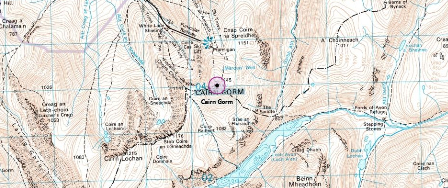
Diagram 1 OS 1:50 000 map
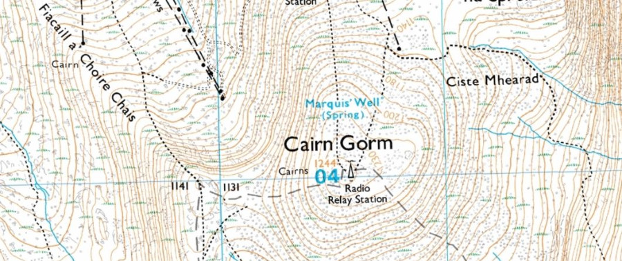
Diagram 1a OS 1:25 000 map
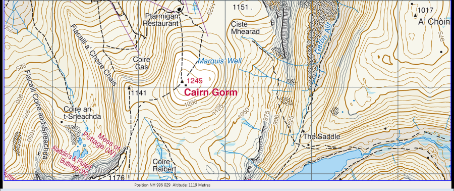
Diagram 2 Harvey's 1:40 000 map
(Map images not to scale, but show the difference in detail and coverage.)
All maps have a network of horizontal and vertical lines printed on them, at I kilometre intervals. This helps to identify an exact location as well as identify where this area of map is in relation to the rest of the country.
These lines are called �eastings� (the vertical lines) and northings� (the horizontal lines) and are numbered from 00 to 99 in 100km blocks. The blocks themselves are identified by letters, which can be seen in the key to the map.
To use the grid lines to identify a location, simply read along the numbers on the eastings first, and then the northings.
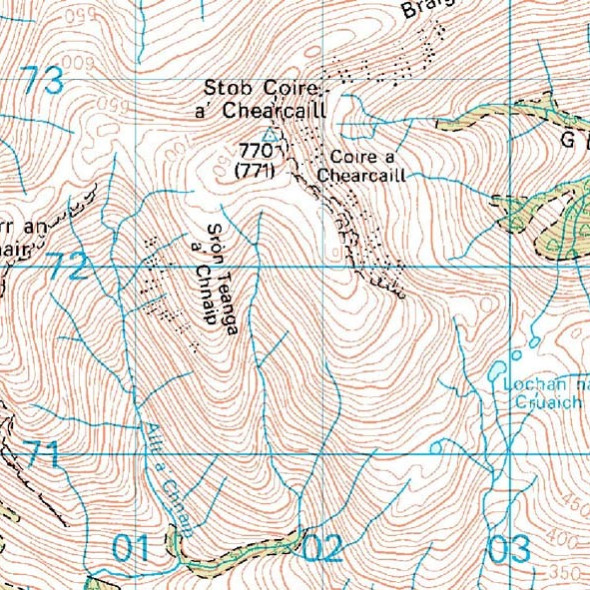
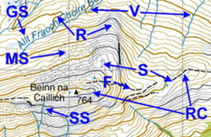
As an example, on the map below, Stob Coire a Chearcaill is in the square 0172. This �four figure� grid reference refers to a square 1km by 1km, which is a large area on the ground. It is standard practice to give a six figure grid reference, which identifies a much more usefully-sized square of 100 metres by 100 metres.
This is done by working out how many tenths within the square the mountain lies, both to the east and to the north of the bottom left hand corner. You could do this by eye but it is far better to use the romer located on the side of your compass. In the present example we determine that the summit of Stob Coire a� Chearcaill is located 7 tenths along and 7 tenths up. The six-figure grid reference is therefore 017727. This gives the mountain�s position correct to within 100 metres.
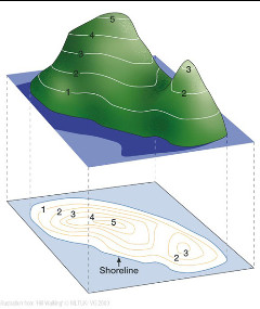
The most useful feature on the map for navigating in the mountains is the contour line. Contours are brown and show the form of the land as well as its steepness. Contours make it possible to �see� the land in three dimensions (see Diagram).
Contour features can nearly always be identified on the ground even when covered in snow. Streams and tracks are useful too but they tend to be less reliable.
A contour line is a line on the map joining points of equal height above sea level. The Contour interval is the height between each contour � this will be shown on the map. The Ordnance Survey (OS) 1:50,000 has a 10 metre contour interval, the OS 1:25,000 maps have a 5 or 10 meter contour interval depending on the area, while the Harvey�s Maps 1:25,000/1:40,000 scale maps have a 15 metre contour interval.
As well as showing height, contour lines also illustrate the shape of the ground. These are known as contour features, common features are illustrated below:
The illustration map below shows examples of all these features.
Contour interpretation is about relating the contour features on the map to the real features on the ground (and vice versa). This can be done in three main ways:
In poor visibility, by examining the contour features on the map and then forming a mental picture of what the ground ahead of you would look like if the visibility was good.
How do we know if the contours on the map are going uphill or downhill? Here are a few tips:
This excellent video made by Glenmore Lodge summarises what you should be looking for in a map and explains the advantages and disadvantages of different scales.
© 2024 Mountaineering Scotland
ClimbScotland is a registered trademark of the Mountaineering Council of Scotland Limited
Mountaineering Scotland is a registered trademark of the Mountaineering Council of Scotland Limited